Visual symbols can help differentiate your brand’s unique story in the marketplace. While a logo doesn’t define the full extent of a brand’s narrative, values or position, it can certainly carry those meanings and build strategic associations in consumers’ minds. That said, it is important to leverage visual branding with a research-driven mindset: we don’t know, or will ever know, everything there is to know about our target audience. The best we can do is remain connected to the many ongoing research projects around what works in the field of visual branding, as well as our own research initiatives aimed at understanding the consumers we serve.
Throughout this article, I’ll share 10 secrets of visual branding unveiled by scientists that have made it the subject of their academic research projects. These findings include insights around logo shapes, the impact of color, the implications behind typography, and important advice around layout.
1. In logo design, natural symbols are preferred over abstract objects.
A study at the Research Centre in Management and Economics – CEGE (Catholic University of Portugal) showed that natural logos outperformed abstract logos when it came down to design preferences. Researchers classified a set of logos as having an abstract or natural design, which in turn could be cultural or organic. Cultural was a type of organic design that featured manufactured objects or cultural symbols, while Organic designs featured biological objects from the natural world. Since natural objects are more common and part of our everyday interactions, they turn out to be more recognizable than their abstract counterparts. Consider this finding as you decide which symbols will compose your logo.

2. Your logo’s attractiveness can affect the way people perceive your company’s performance.
You may not think visual choices affect your company or product’s actual performance, and you could be right. However, in a world where consumer perception plays a crucial role in assessing performance, you want to be fully aware of the consequences an attractive visual symbol (i.e. logo) can have in the way the brand experience is perceived. A group of researchers asked theatre-goers to evaluate the organization behind the play in relation to its performances and current logo. What they found is that logo characteristics like attractiveness and recognizability are related to the consumer’s perceptions of the organization’s actual performance. Next time you analyze the potential impact a redesign might have, take into account the indirect consequences it may have on consumer perception of the brand experience as a whole.

Photo by Paweł Czerwiński on Unsplash
3. Package designs affect a consumer’s impressions of the brand’s personality.
An academic study published by the American Marketing Association explored how different package designs were associated with consumer brand impressions. Splitting package designs into five types (massive, contrasting, natural, delicate, and nondescript), researchers found that massive packages are related to above-average ruggedness, contrasting packages generate excitement, natural designs are linked to sincerity, and delicate designs are associated with sophistication. They concluded that brands wanting to be perceived as sincere should have natural package designs, “exciting brands should have contrasting designs, competent brands should have delicate designs, sophisticated brands should have natural or delicate designs, and rugged brands should have contrasting or massive designs.”

4. The right font can trigger higher consumer interest in your product.
How important is selecting an appropriate font for your brand’s visual identity? According to this paper by researchers at the University of Wales, very. In their study, brands were chosen twice as frequently when they were in an appropriate font in comparison to when they were not. This effect shows the importance of adopting a type family that is consistent with the brand’s space, offer, and values.

Photo by Hubble on Unsplash
The obvious question here is how to go about selecting a font that is perceived as appropriate for the product/service one is trying to brand. And the answer may just lie in the team and expertise you assemble during the brand development process. I’ve seen the benefits of approaching brand design with a holistic perspective firsthand: looking at the process with business, design, and psychology principles in mind yields incredible clarity when it comes down to selecting elements like font families. If you are in the middle of the process and need support, get in touch to explore ways in which we could work together.
5. Type harmony and flourish are crucial when building a distinctive brand personality.
Just like packaging designs can affect brand personality perceptions (see secret #3 above), type families carry associations that can support a certain characteristic. In a series of studies around the influence of type on brand personality perceptions, researchers found that naturalness, harmony, and flourish were the most important type font characteristics, in the sense that they evoked higher levels of most brand personality dimensions. Specifically, fonts that appeared harmonious (symmetrical/balanced), natural (organic), and had a certain flourish (serifs) seemed to associate the brand with a sense of excitement, sincerity, sophistication, ruggedness, and competence. Aside from that, researchers found that more weight (a bolder font) enhanced ruggedness, while a lighter font signaled sincerity and sophistication.

6. Functional products benefit from using functional colors, and sensory products benefit from using sensory colors.
There are many ways to classify products, but a simple distinction appears when you look at what kind of need the good or service fulfills. Functional products are those that solve or prevent a problem, while Sensory-social products help us express ourselves and convey our values. A research study at the Cardiff Business School followed this approach to demonstrate how those two types of products could benefit from designing a brand that featured equally functional or equally sensory color selections. The study also shed light on the kinds of colors consumers themselves identify as “functional” or “sensory”, where gray, black, blue, and green being connected to the first value and red, yellow, pink, and violet to the latter. What these researchers found is conclusive: consumers perceive functional colors as more appropriate for functional products, and the same holds for sensory colors in relation to sensory products. Properly chosen colors can add immediate value to a brand and it’s positioning.
7. Print branding pieces can send quality signals via typography and paper type.
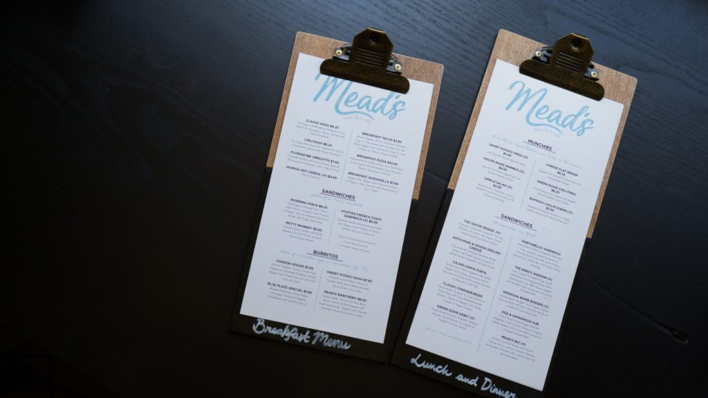
Perhaps you’ve intuitively understood the value of certain brand cues: sophisticated fonts and fancy paper may have drawn your eye while at a restaurant. A research study on the influences of certain menu design decisions showed that italicized fonts and heavier menus influence how upscale the brand is perceived to be, as well as the level of service quality one can anticipate. When making decisions about your brand’s stationery pieces, consider how paper type and font selection can play a role in your potential customers’ impressions of your brand and its competence.

8. Circular and angular logos affect how comfortable your brand is perceived to be.
How angular or circular your logo is can help shape certain brand attributes. At least this is what four researchers found when they ran 5 experiments to understand how that basic layout variation (whether the logo is circular or angular) is related to different perceptions about the brand. According to their findings, circular logos were associated with more comfortableness (a softness-related attribute), while angular logos led to more favorable perceptions of durability (a hardness-related attribute). Whether your brand is immediately linked to softness or hardness can affect product judgments and certain experience perceptions. Take this principle into account as you decide what kind of lockup makes sense for your brand’s visual symbols.
9. Logos generate higher credibility when they are harmonious, simple, and consistent with your website’s design.
The way your logo is designed can help your brand capture user attention and convey credibility in split seconds. A study published in the International Journal of Human-Computer Interaction demonstrated that logos designed to communicate traits of credibility (like expertise and trustworthiness) triggered positive judgments about how reliable a company was, and that resulted in more willingness to interact and transact with that brand. The paper included some guidelines regarding the types of logos that would convey that kind of credibility:
- If possible, include an image or symbol that is representative of the business’ area of expertise.
- Use color schemes that communicate safety or reliability.
- A logo design should be clear and easy to interpret. Watch out for issues like lack of readability and low contrast.
- Make your logo consistent with your website’s design, since that consistency communicates reliability.

10. Use the Divine Proportion or Golden Ratio in your favor.
You may have heard of the Golden Ratio or Divine Proportion, which is nothing more than an attempt to mimic the aesthetic proportions found in nature to apply that pleasing balance to design compositions. The hypothesis is that layouts are more attractive when the ratio of their larger to smaller dimensions is 1.618. In a Monash University study about the Divine Proportion’s influence on logo design, results showed that logos based on forms found in nature (following the Divine Proportion) were most preferred.
Have you found any other interesting studies about visual branding? Feel free to share in the comments area below. If you are in the middle of the brand development process, or would like to get started and need support, get in touch here to explore ways in which we could work together.
